Relque
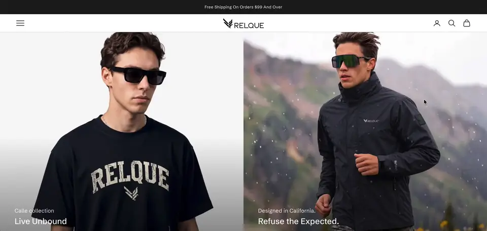
relque.com ↗Relque is a California outdoor clothing brand using mostly organic and recycled materials, with a recycling QR code in every piece. We redesigned the store on Prestige with Kiwi size charts, stacked product galleries and a cart drawer upsell.
- Niche
- Fashion
- Engagement
- Redesign
- Services
- Store redesign, product pages, size charts, cart upsell, speed work
- Platform
- Shopify
The brief they came with
Relque sells outdoor clothing such as the Condor Windbreaker, Atacama Hoodie, Torres Vest and the ReAndes adult and youth T shirts. The brand sells only in the USA. The team was moving the store to a new Prestige theme and wanted it live within a few weeks. They wanted it to feel calm, editorial and close to the product pages on Vuori.
The brief covered the product page layout, size charts with clothing drawings, button and label styling in the brand's colors, and alignment on the content pages. It also covered a cookie banner, an upsell in the cart, a WhatsApp contact and page speed after launch.
The problem
Product images sat in a thumbnail carousel. Shoppers had to click to see each photo. For clothing, people want to scroll and see fit and fabric without extra steps.
There were no proper size charts. The team wanted charts that matched the site, with a drawing of each garment. The Kiwi free plan only allows two published charts, which was not enough for the range.
Small details looked off brand. Selected size buttons were black, not the logo green #96a281. The Size Chart link and Regular Fit label sat in boxes like buttons and competed with Add to Cart. The purple Shop Pay button did not fit the look either.
The content pages did not line up on desktop. About Us, ReText and Accion Andina looked right on mobile but uneven on larger screens. The FAQ page had dropped out of the footer.
After launch, someone told the team the main image took 5 seconds to load. Unused sections were still in the theme and adding weight.
What we built
- 01 Brand colors and quieter product controls We changed the selected state on the product page buttons from black to the logo green, #96a281. We then reworked the buttons to a softer grey based on the Vuori reference. The Size Chart link and the Regular Fit label lost their borders, backgrounds and shadows. Both now read as plain text labels, so Add to Cart is the clear action. We also replaced the purple Shop Pay block with a more subtle treatment.
- 02 Stacked image galleries on every device We replaced the thumbnail carousel on product pages with a stacked, vertical gallery. Customers now scroll through every photo without clicking. We matched the mobile behaviour to the Vuori reference pages the team shared, so swiping through images and opening the size chart feel the same on a phone. We also fixed the size chart display on mobile, where the logo inside the chart was not showing properly.
- 03 Kiwi size charts with garment drawings We set up Kiwi Size Chart & Recommender on the Prestige draft theme. The first chart went on the Condor Windbreaker, linked to the product by a condition in the app. We then uploaded both drawing options, black on the Atacama Hoodie and white on the Condor Windbreaker, so the team could compare them. Once Kiwi was upgraded to the plan for up to 10 charts, the team added the remaining drawings and measurements.
- 04 Cart upsell and a US only market We installed an upsell app and styled its widget for the cart drawer. As a test funnel, the upsell shows only when the Condor Windbreaker is in the cart. The team can add new funnels for other products from the app. We first added a Canada market for a currency switcher. When the team confirmed they sell only in the USA, the store went back to USD only and the switcher was removed.
- 05 Launch fixes across content pages In the lead up to launch we worked on backup copies of the live theme, so the team's own edits were never overwritten. We aligned the text on About Us, ReText and Accion Andina to match how they read on mobile. We put the FAQ page back in the footer and added a WhatsApp number to the contact page. We also removed product pictures from reviews and set up the cookie banner, which appears once the theme is live.
- 06 Speed work and fixes after launch After launch we reduced gaps around the app sections and collection title, and made the product video section shorter. We swapped in the brand's own SVG logo files so the black logo stopped looking pixelated. For speed, we deleted unused sections and lazy loaded images in the image with text overlay section with low fetch priority. We also moved the popup JavaScript out of the first render.
Results
Stack & apps
- Shopify Platform
- Prestige Theme, customized
- Kiwi Size Chart & Recommender Size charts with garment drawings
- Essential Upsell & Cross Sell Cart drawer upsell funnels
- Section Store Extra theme sections
- Shopify Markets US only, USD store
- Custom CSS and JavaScript Stacked galleries, lazy loading




Want this for your store?
Tell us what's wrong, or what you're trying to build, and we'll take a look at your storefront.