Būma Coffee
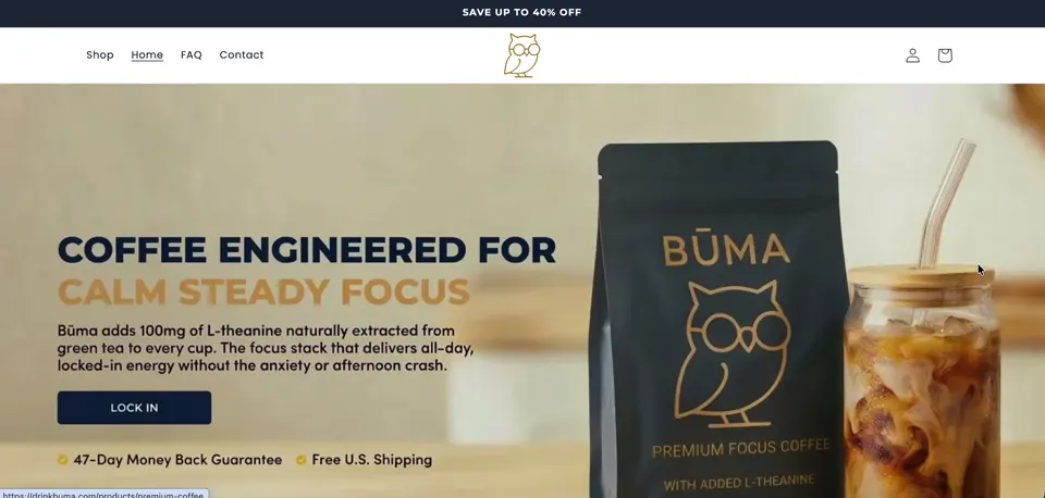
drinkbuma.com ↗A US functional coffee brand selling one product: instant coffee with L-Theanine. We designed and built the storefront straight off the back of their preorder launch.
- Niche
- Food & Beverages
- Engagement
- Full build, 4 weeks
- Services
- Shopify complete website development, Store optimization
- Platform
- Shopify
The brief they came with
The founder messaged us from a hospital room.
His wife had just had their first baby. The preorder round was finished, the ads were running, traffic was arriving, and almost nobody was buying. He could see the problem and had no hours left in the day to fix it.
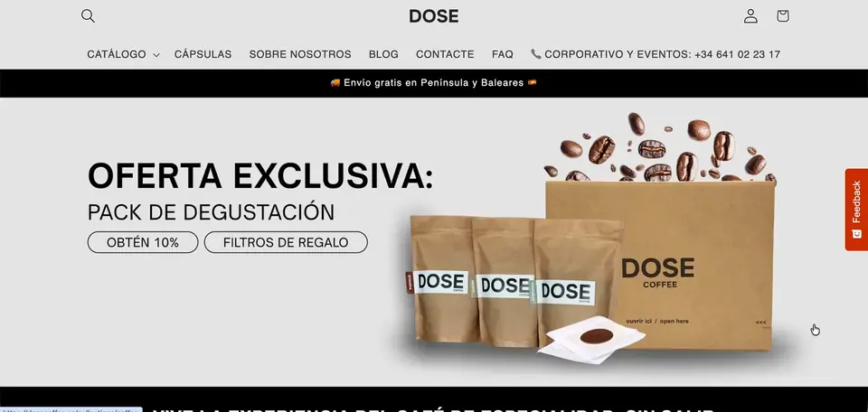
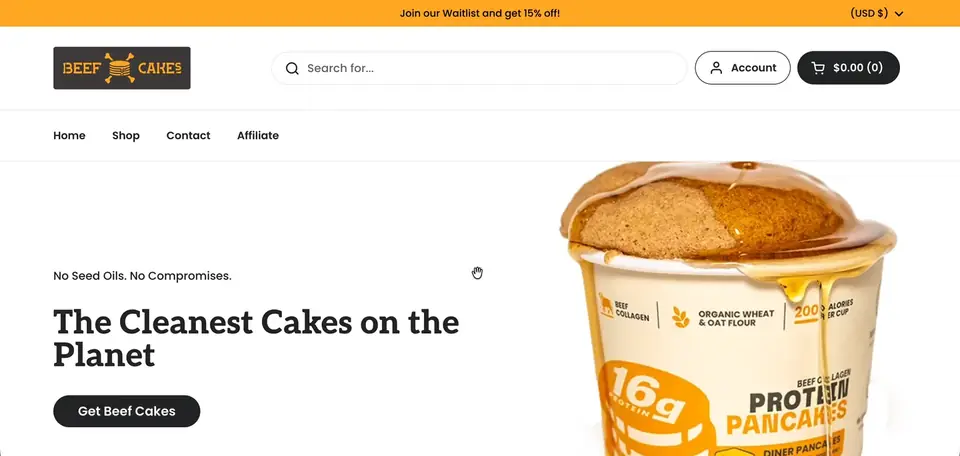
He sent three things: the site, the brand colours (navy blue and gold), and the brands he wanted to be measured against. Everyday Dose first, then Primal Queen and Grüns.
The ask was simple to state and hard to do quickly. Turn the ad traffic into orders, and leave behind a site he could edit himself once we were gone.
The problem
The store was still built like a preorder page, and the brand had moved past preorder.
"Preorder" was still sitting in the header. The footer links went nowhere. Under the hero sat a press scroller carrying logos the brand had not earned yet, Gear Patrol, Well+Good, Forbes. The hero itself was two images fighting each other, washed out and colour-shifted. A first-time visitor arriving from an ad had no way to tell in five seconds what Būma was, who it was for, or why it was different from any other bag of coffee.
Underneath that sat the commercial gap. One bag, one price, one way to buy. No subscription, no reason to take two instead of one, and a review widget customers could not actually post to, on a brand whose only real proof was its beta testers.
And the traffic was mobile. Most of it. Mobile was the layout that did not work.
What we built
- 01 A homepage that makes the case in order Rebuilt around a single flow: problem, solution, benefits, proof, call to action. Designed in Figma first, then implemented as native Shopify sections so the founder can reorder and edit it without us.
- 02 A product page built for a first-time buyer Benefit-led layout, sticky Add to Cart on mobile, clear usage instructions, an FAQ placed where the objections actually happen, and shipping and returns reassurance sitting next to the button.
- 03 Pricing that gives people a reason to take more Tiered bundles through Kaching: one bag at 10% off, two bags at 20% and free shipping marked Most Popular, three bags at 30% and free shipping marked Best Value. Every tier carries both a one-time purchase and a Subscribe and Save option, with a widget that lets customers manage their own subscription.
- 04 Proof the brand had actually earned Judge.me review submission fixed so customers could post, a full review section added at the bottom of the page in the pattern of the benchmark brands, borrowed press logos removed, and a video section built to play real video on both desktop and mobile.
- 05 Mobile treated as the main site, not the second one A full responsive pass across home and product pages, pulled forward mid-build when traffic spiked and the founder asked for it. Hero text set inside the image rather than stacked above it, on both breakpoints.
- 06 The pages and flows that carry trust About and founder story, FAQ, Contact and policy pages. One clean delayed popup connected to Klaviyo, with abandoned checkout flows behind it to catch the orders that stall.
Results
Stack & apps
- Shopify Platform, Shopify Payments, native checkout
- Custom sections Theme built natively, no page builder
- Figma Design approved before a line of code
- Kaching Bundles Tiered quantity offers and free shipping thresholds
- Subscriptions Subscribe and Save with customer-managed subscriptions
- Judge.me Reviews and review capture
- Klaviyo Email, popup and abandoned checkout flows

Want this for your store?
Tell us what's wrong, or what you're trying to build, and we'll take a look at your storefront.