Quinby's
quinbys.co ↗Quinby's is an Australian Hot & Chilli Honey brand, sold in stores and on Amazon rather than on its own site. We redesigned the store on Dawn with Buy on Amazon buttons, a stockists page and a 1L commercial page.
- Niche
- Food & Beverages
- Engagement
- Feb 2026 to Aug 2026
- Services
- Shopify website redesign, Custom page templates, Stockists page
- Platform
- Shopify
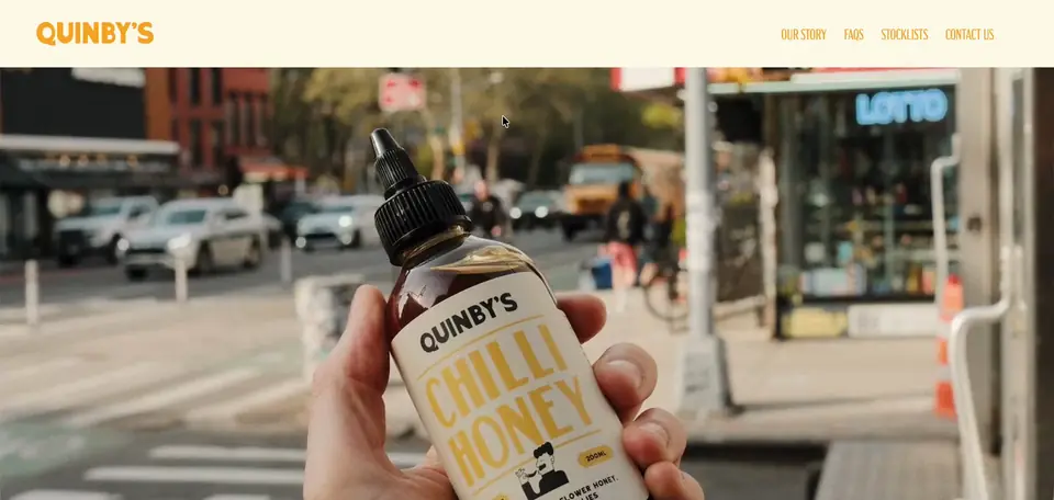
The brief they came with
Quinby's makes Hot & Chilli Honey, Australian wildflower honey infused with habanero chillies, in two sizes. The 200ml bottle sells in stores and on Amazon. The 1L bottle goes to commercial kitchens. The brand already had a Shopify store, but it did not sell anything and the team described it as quite basic. They wanted a site that looked as good as the product, was easy to use on mobile, and sent buyers to Amazon.
The brief covered a full redesign using itsolio.com.au as the reference, a clear Buy on Amazon call to action for the 200ml bottle, a separate page for the 1L bottle and the restaurants using it, an As Seen In banner, a stockists page, an Instagram feed and a blog page.
The problem
The site had no clear route to buy. Quinby's does not sell on its own store, so every visitor who wants a bottle has to be sent somewhere else. Without a strong Buy on Amazon button, that interest had nowhere to go.
The stockists page linked out to an external website. Shoppers who wanted to pick up a bottle in store had to leave Quinby's site to find one, and the brand lost the chance to show off the retailers carrying it.
The 1L bottle had no home. Chefs and restaurant buyers had nothing to look at, and no proof that other kitchens already use it. That mattered because the 1L is sold only to commercial kitchens.
There was little social proof on the site. The team had press logos and an Instagram account, but neither appeared on the store, so a first time visitor saw none of it.
The look did not match the brand. Quinby's had full brand guidelines covering fonts and colors, including a marquee style headline font, but the old site did not reflect them.
What we built
- 01 A homepage in Quinby's own brand style We started with the homepage sections on Dawn, working from the brand guidelines PDF and the marketing material in the team's Google Drive. Headlines use Main Feature JNL, the theater marquee style font from the guidelines. It is a paid font, so the team sent over their font files and we applied them to the H1s. After the first desktop preview, the team asked for the top menu banner in the brand's milk color instead of black, and we updated it. The homepage also carries an As Seen In banner using the team's logos.
- 02 Our Story, Contact and FAQ pages Next came the inner pages. We built an Our Story page to tell the brand's background, a Contact page, and an FAQ page, all in the same fonts and colors as the homepage. Each one went to the team as a preview on the draft theme, so they could review it without touching the live site. The team signed off on the FAQ page on the first pass and said the fonts matched their brand file.
- 03 A stockists page organized by state The old stockists page sent people to an external website. We rebuilt it inside the theme using the brand's existing stockist data, with no extra app. Stores are grouped by state and show the retailer's logo where one was available. The team asked for Harris Farm in the top row for NSW and QLD. Because Harris Farm has multiple stores, its card links to the Harris Farm website. Once the layout was approved, we added every remaining stockist.
- 04 A commercial page for the 1L bottle We created a new page template for the 1L bottle and assigned it to a dedicated commercial page. It uses the team's photos of the 1L bottle from their Drive and names the restaurants that use it: AP Pizza in Sydney, Fabbrica in Sydney, Mapo Gelato, Belles Hot Chicken and Pocket Pizza. Chefs and buyers now have one place to see the commercial bottle and the kitchens already pouring it.
- 05 Buy on Amazon, Instagram and mobile With the pages in place, we added Buy on Amazon calls to action for the 200ml bottle. We connected the Instafeed app to the brand's Instagram account. Instafeed only displays on a live theme, so the feed was set to appear once the new theme was published. We then worked through mobile responsiveness across every page.
- 06 A handover call so the team can edit After a pause on the brand's side, the team came back in August 2026 to finalize the site. Their main question was whether they could change copy and images themselves. We ran a walkthrough call showing how to edit text, swap images and update links in the theme editor, and agreed to help with any issues as they made updates.
Results
Stack & apps
- Shopify Platform
- Dawn Theme, customized
- Instafeed Instagram feed on the site
- Amazon Where the 200ml sells
- Main Feature JNL Marquee style headline font
- Custom stockists section Stockists by state, no app
- Custom commercial page template 1L bottle and restaurants


Want this for your store?
Tell us what's wrong, or what you're trying to build, and we'll take a look at your storefront.