Sunborne
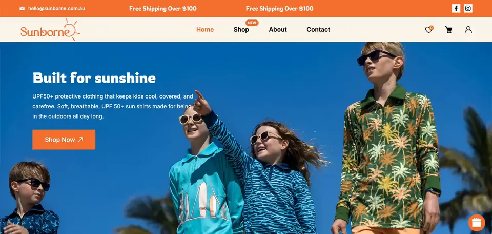
sunborne.com.au ↗An Australian start-up making UPF 50+ shirts for kids, launched by founder Sarah Kirk with a small range of six designs. We refreshed the existing store with calmer brand colours, a cleaner mobile layout, a tidier product page and a 10% email pop-up.
- Niche
- Baby & Kids
- Engagement
- Nov 2025 to Apr 2026
- Services
- Shopify store redesign, mobile UX fixes, email capture pop-up
- Platform
- Shopify
The brief they came with
Sunborne sells sun-safe shirts for children, made for the beach, the pool and the backyard, in sizes 4 to 12. Another developer had built the store, and Sarah was not happy with how it looked, even after several rounds of fixes. She did not want a new website, only for the existing one to look more professional.
She pointed us to The Nashie and Silux as examples of clean, on-brand and easy-to-use stores. On a kick-off call she listed the changes: consistent colours, better Add to Cart and size buttons, a cleaner mobile layout, a 10% email pop-up, shorter product pages, smaller recommended products and simpler desktop navigation.
The problem
The colours were inconsistent and looked childish, especially on mobile. Sections like "Explore Latest Collection" did not match the orange of the brand logo.
On mobile, each product card showed in a different colour, so the product grid looked messy instead of being a clean, consistent view of the range.
The product page was hard to use. The size buttons and the Add to Cart button sat oddly next to the quantity selector, the headings used different fonts, and there was a lot of white space to scroll through.
Recommended products under each shirt were as big as the shirt itself, and every product name started with "Sunborne", which added nothing.
The discount field in the cart did not work, and the store had no way to collect emails from first-time visitors.
What we built
- 01 A consistent, grown-up colour scheme We worked on a copy of the store's theme so the live site was not touched while changes were reviewed. We replaced the mixed, childish colours with a consistent palette built around the brand orange, on desktop and mobile. The goal was a store that still feels bright and made for kids, but reads as a professional brand to the parents buying.
- 02 A clean mobile product grid We rebuilt the mobile product listing so all cards follow the same clean style. When the first version showed only part of the range, Sarah asked for every shirt to appear on the homepage because the line is small. We added the missing products back, removed duplicates in the next round, and every design now shows once in a tidy grid.
- 03 A tighter product page We aligned the size buttons, quantity selector and Add to Cart button, matched the heading fonts, and cut the white space on the product page and homepage so shoppers scroll less. We removed the "Sunborne" prefix from product names, took out the broken cart discount link, and made recommended products smaller so they work as a quick peek at other designs.
- 04 A size guide that works on every screen We added a "Size Chart" link on the product page in the brand orange, using Sarah's own size chart. The size guide has separate image settings for desktop and mobile, so the team can upload a portrait image for phones and a wider one for desktop without touching code.
- 05 A 10% email pop-up for first-time visitors We set up Coupon X to show first-time visitors a pop-up offering 10% off their first order in exchange for their email. The code appears straight away in the pop-up, can be copied, and works once per customer. We used Sarah's own wording ("Want to receive 10% off your first order?" and a "Sign up now" button) and later showed her where to edit it in the app herself.
- 06 Simpler navigation and handover We changed the desktop menu headings so they are no longer dropdowns, matching the cleaner look of the reference stores. Once Sarah approved every point, she published the new theme and it became the live store. A month later she asked how to change the pop-up text herself, and we sent step-by-step instructions with screenshots.
Results
Stack & apps
- Shopify Platform
- Aforapple Theme, duplicated and customized
- Coupon X: Discount Code Pop Up 10% first-order email pop-up
- Size guide section Separate desktop and mobile size charts
- Product recommendations Smaller "you may also like" row
- Slick carousel Homepage and product sliders
- Shopify Payments, Shop Pay Checkout


Want this for your store?
Tell us what's wrong, or what you're trying to build, and we'll take a look at your storefront.